Bringing spark to further education
Bradford College
Bradford College is one of the largest further and higher education and training providers in West Yorkshire, providing a wide range of career-focused T Levels, vocational qualifications, community courses, apprenticeships and degrees. They approached Bell to elevate their school promotional materials to help them stand out from the crowd to their primary audience of 16-19 school leavers. Our brief was to create a consistent look and feel in harmony with their brand guidelines for all their school liaison materials digital and print, that was at once impactful, memorable and enticing to youth audiences.

Our response
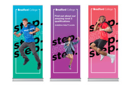
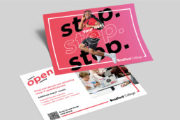
To give us the right platform to elevate their promotional materials, we began by developing a campaign proposition, “Take your next step”. This also provided us with the key design elements for the campaign. All materials featured “Your next step” in large solid text, repeated several times, with the central message being outline only, superimposed over an image of a student. We also provided guidance on how to use different messages while retaining the graphic effect.
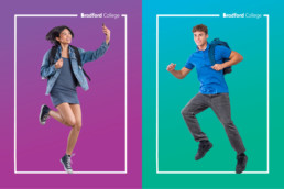
All campaign images showcased students in dynamic poses, stepping, jumping and moving in the air, interacting with the headline text and a border frame to create the feeling that the students are stepping up to their next stage in life. Bell selected six models to represent students (three boys and three girls from different backgrounds) who we shot in a studio in Manchester, photographed at the apex of a jump on a trampoline, to highlight dynamic movement and to get the most emotive and exuberant expressions from our models. Models were shot individually and in groups, to provide ample variations for future requirements.
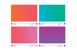
The headline pattern design could be used for other headlines as a template. We also developed a style guide on how to apply the look and feel and develop future materials. This included a bright colour palette inspired by their existing brand guidelines but extended. We chose six vibrant colours (red, purple, blue, pink, orange and green, plus black and white) from the guidelines and developed a gradient style to help them stand out even more (orange to red, blue to green, red to pink, purple to purple tint).
For collateral, we provided a PowerPoint template design including a cover section, dividers, standard style with some examples and back cover, with colours and styles built in, A5 editable postcard templates to promote events and competitions, three pop-up banners, bookmarks, email headers and footers.