A brand at one with its surroundings
Southern Housing – Greenside
Perceptions of Alton Road, in Roehampton, have long been tied to perceptions of Alton Estate, one of the largest council estates in the UK that dates to the 1950s. When Southern Housing (then Optivo) commissioned a collection of mixed Shared Ownership/extra care apartments at the southern end of Alton Road, they were concerned that people would automatically think/‘high-rise’. The area of the development is anything but, incredibly verdant and surrounded by lowrise lower density properties, with no high-rise buildings visible. Bell was commissioned to create a versatile scheme brand and marketing campaign for the Shared Ownership part of the development and ensure that perceptions matched reality.
Our response
Site and location visits are an imperative part of the process of branding and marketing for
any property development. Nothing compares to the clarity and purpose it can bring to the process. This was no exception. All the photos and Google Street View images did not do the area and its surroundings justice. ‘Green’ is by far the dominant thought when there.
Not only on the street itself but also on neighbouring streets and open spaces – it’s located on the junction of two of London’s most iconic green spaces, Richmond Park and Putney Heath & Wimbledon Common, literally right beside Richmond Park Golf Course. Its lush green nature was the motivation for the scheme name Greenside – it was literally ‘greenside’ to the greens on the course, and right next to so much green open space.
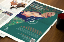
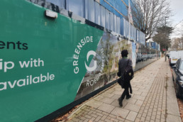
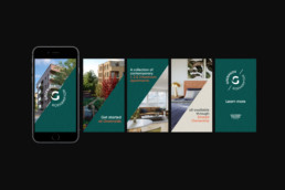
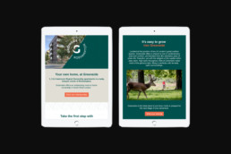
Our visual identity uses a motif based on the shadow of the negative space of a large “G”, which is also the shape of the beautifully landscaped garden between the buildings. It also features a design pattern with semi-circular arcs which are also used as headline devices across all materials. The ‘green’ theme is also manifested in a stylish, leafy background pattern. For the campaign, we produced literature, floor plans, exterior and interior CGIs, a site hoarding with an elevated ‘G’, and ads for both digital and print. When the show home was completed, we helped with the dressing and even designed and installed a ‘tunnel’ from the street to the home, so visitors didn’t feel like they were walking through a building site to get to it.


